Geovisualization
Helena Mitasova
GIS/MEA582 Geospatial Modeling and Analysis NCSU
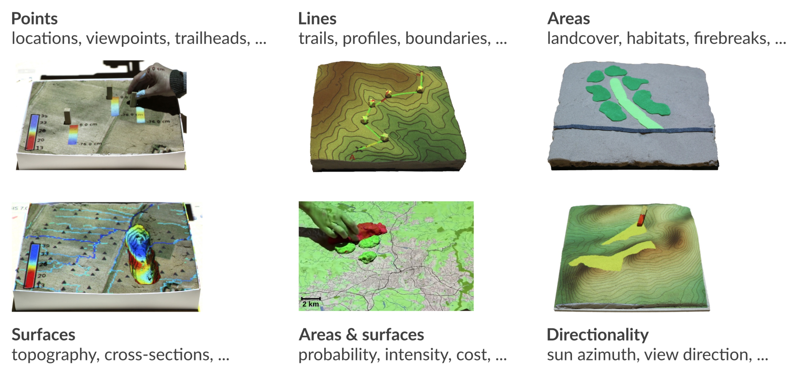
Learning objectives
- understand scaling properties of raster and vector data display
- select suitable color ramps for raster data
- use relief shading to analyze surface structure
- explain and use 3D visualization: single and multiple surfaces
- understand applications of dynamic visualization with animations
- discuss properties of tangible interaction
Role of geovisualization
- Visual analytics: highlight spatial patterns or features
- Communication of geospatial information
- Example: Explore Global Weather Conditions at
earth by Cameron Beccario
Near-real time dynamics, presented in several projections
Display of raster and vector data
- all data displayed on computer screen are rasters, what you see is controlled by the resolution of your map display
- raster data: as we zoom in, raster grid cells become visible, reinterpolate to higher resolution to smooth out the effect
- vector data: vertices are connected by rasterized line, it is scalable, limited only by the dispaly resolution
Display of large rasters
If the number of rows or columns in a raster is greater than those of map display,not all pixels are visible (red): convert to vector representation (blue)
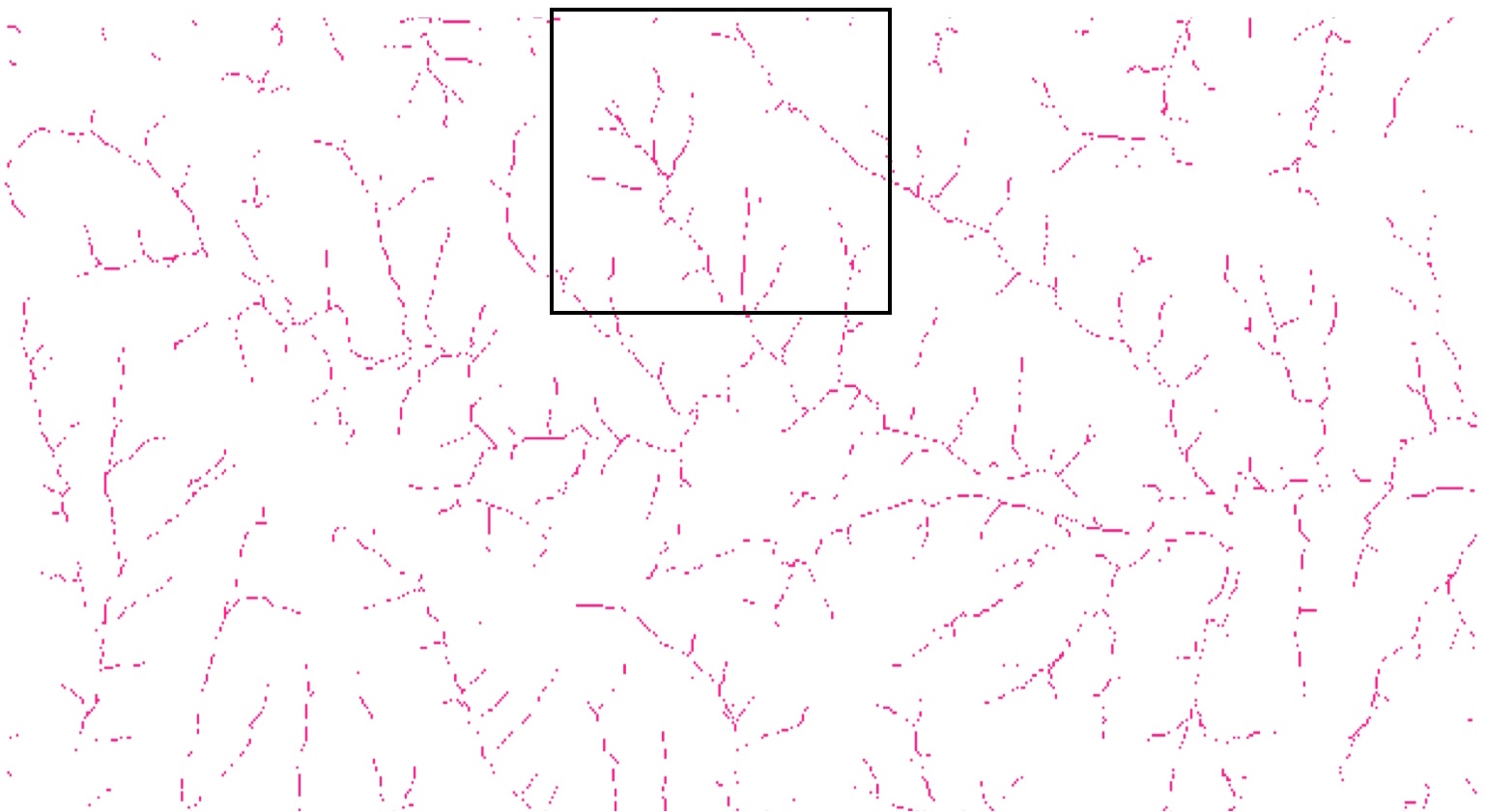
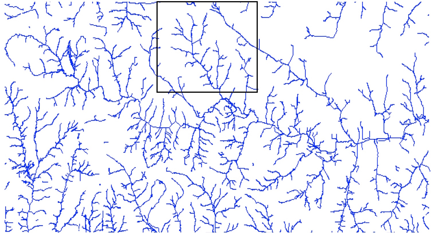
Example:3000x3000 raster in 1000x1000 window only every third pixel shown, zoom to 500x500 subset shows all pixels.
Working with color
- Color components: hue, brightness, and saturation
- Quantitative representation: Red + Green + Blue
- Color for raster data: discrete or continuous
- Continuous interpolates RGB values based on the values in the raster map
- Color for vector data: usually discrete by definition
Learn more about color (see supplemental material)
Colors for discrete raster data
- quantitative data: constant hue, color intensity is a function of values
- qualitative data: constant intensity, varied discrete hue
Soil erodibility (see units here) and Soil ID maps
Colors for continuous raster data
- continuous color highlights continuous property
- discrete color: convert the continuous data to discrete classes; some information is lost
note: default color ramp for FP maps is often greyscale with uniform interval
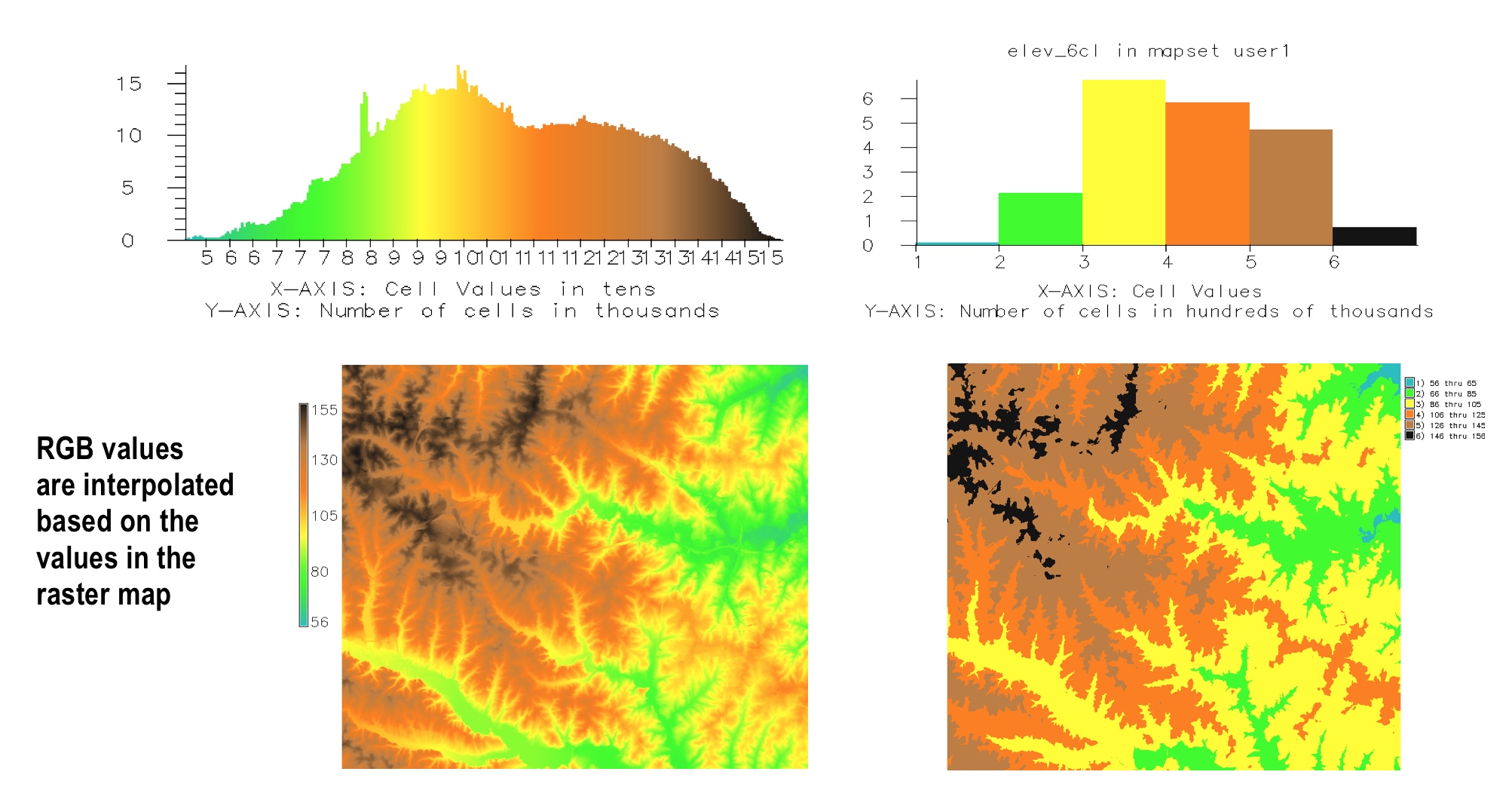
Colors for continuous raster data
Distribution of color based on uniform raster data intervals
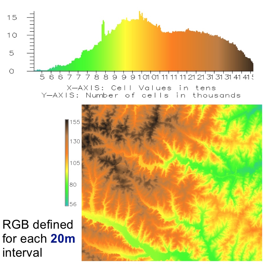
Uniform intervals work for elevations in Piedmont, but for entire NC this approach highlights that most NC is flat coastal plane but we don't see its subtle topography structure
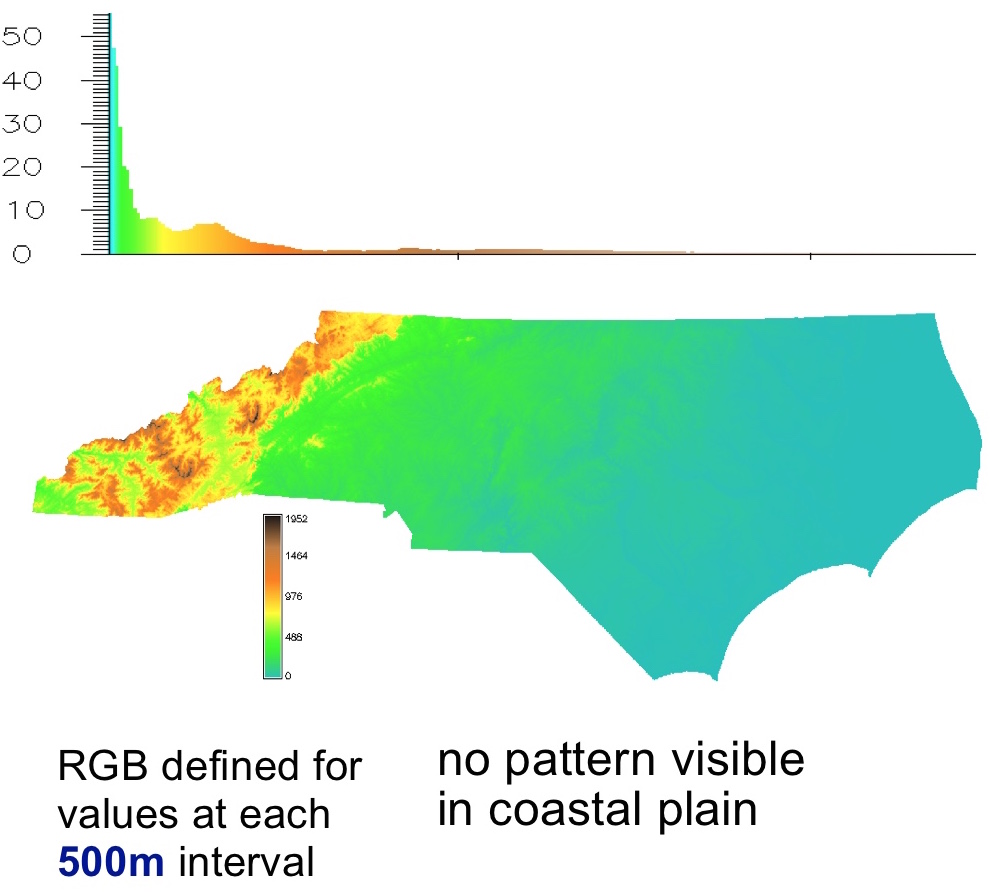
Histogram equalized color
Distribution of color based on histogram of raster data values and a custom color ramp
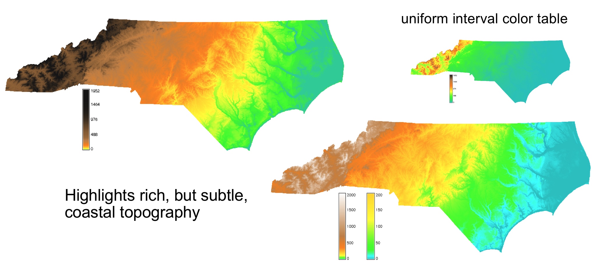
Assigns color based on intervals which cover approximately the same area.
Highlights topography structure but distorts the elevation differences
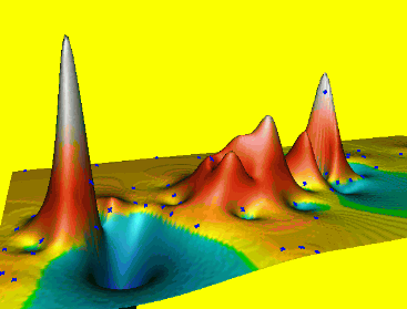
Color for non-linear distributions
- Flow accumulation data range over several magnitudes
- Uniform interval color ramp
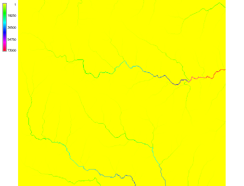
The flow accumulation values range between 1 and 73000 with large number of cells with small values and small number of cells with very large values
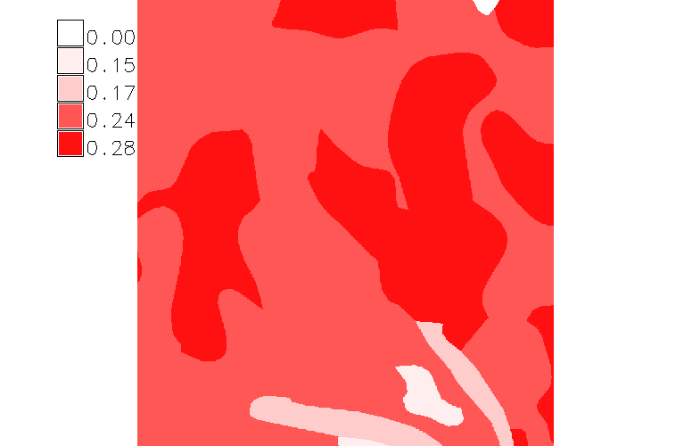
Color for non-linear distributions
- Flow accumulation data range over several magnitudes
- Histogram equalized color ramp: green-yellow-blue
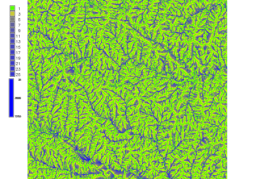
The high flow accumulation which represents the main streams is lost.
Color for non-linear distributions
- Flow accumulation data range over several magnitudes
- Logarithmic color ramp: green-yellow-blue
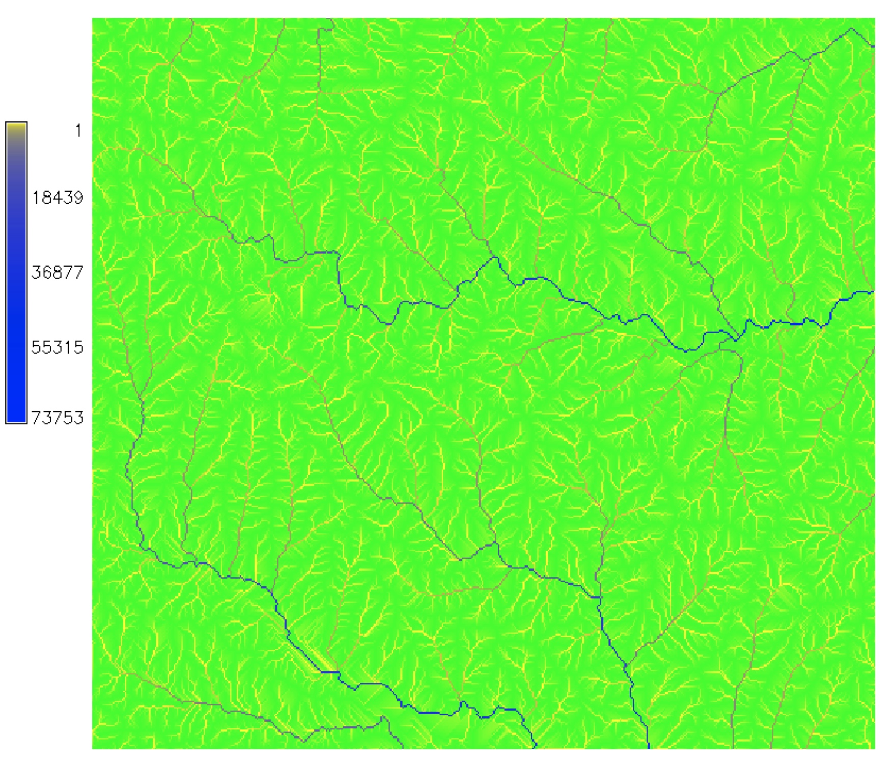
Highlights the main streams with good representation of smaller streams
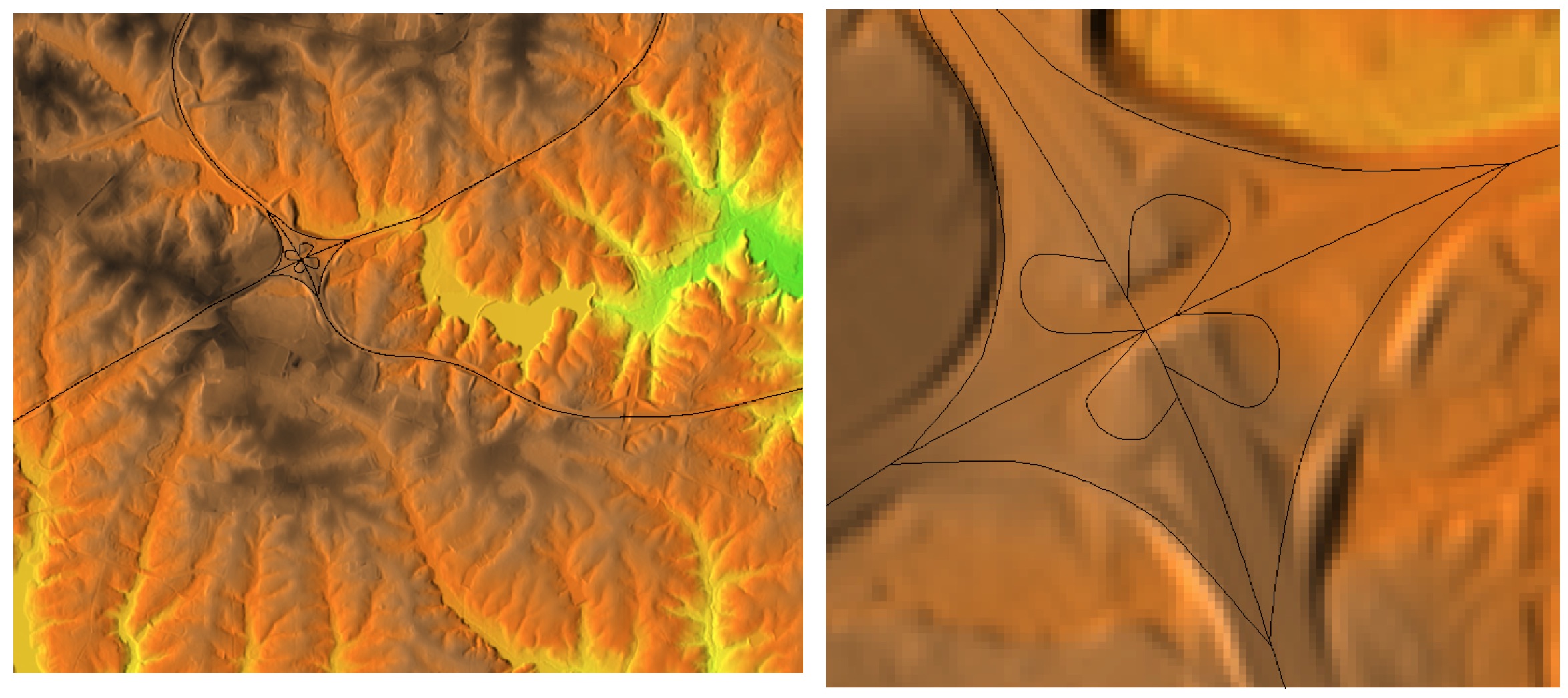
Color for non-linear distributions
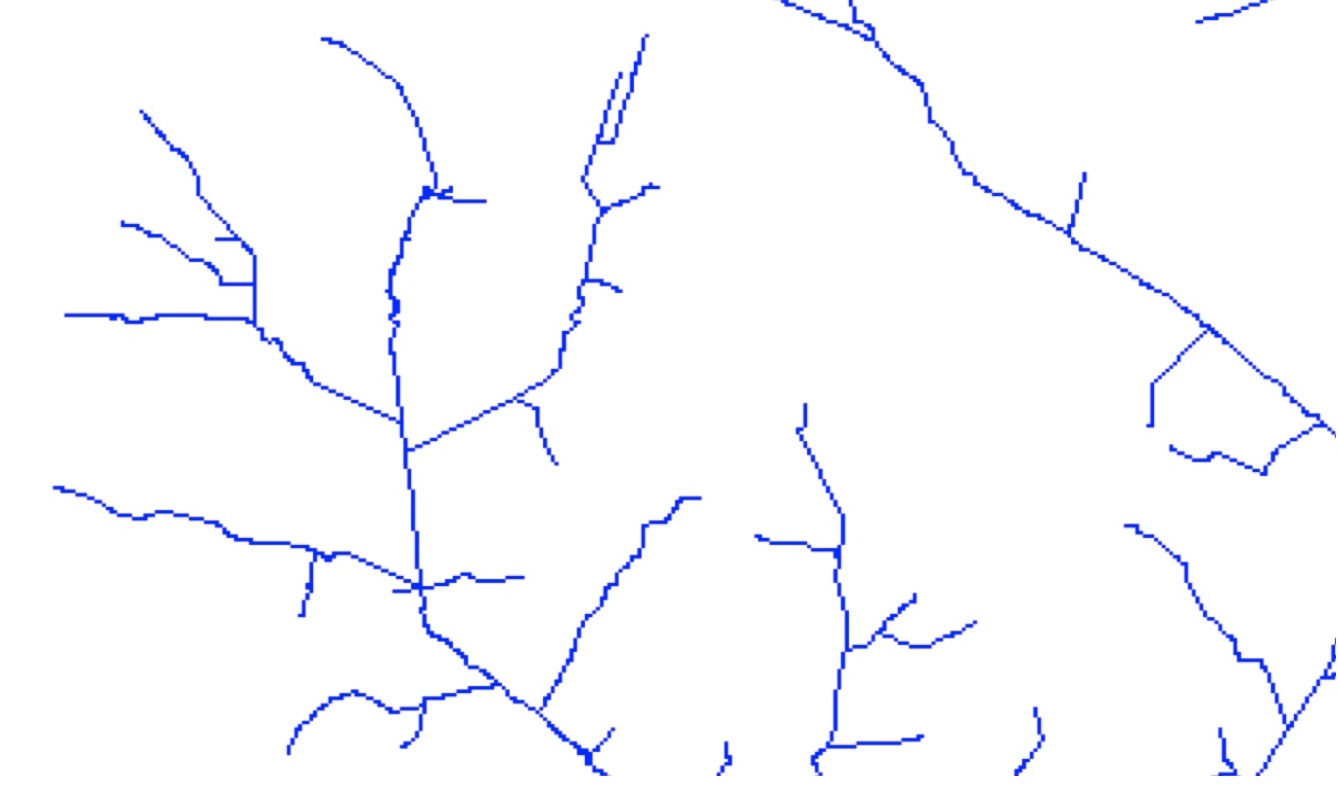
- Convert to vector model with stream order
- Color, width based on stream order
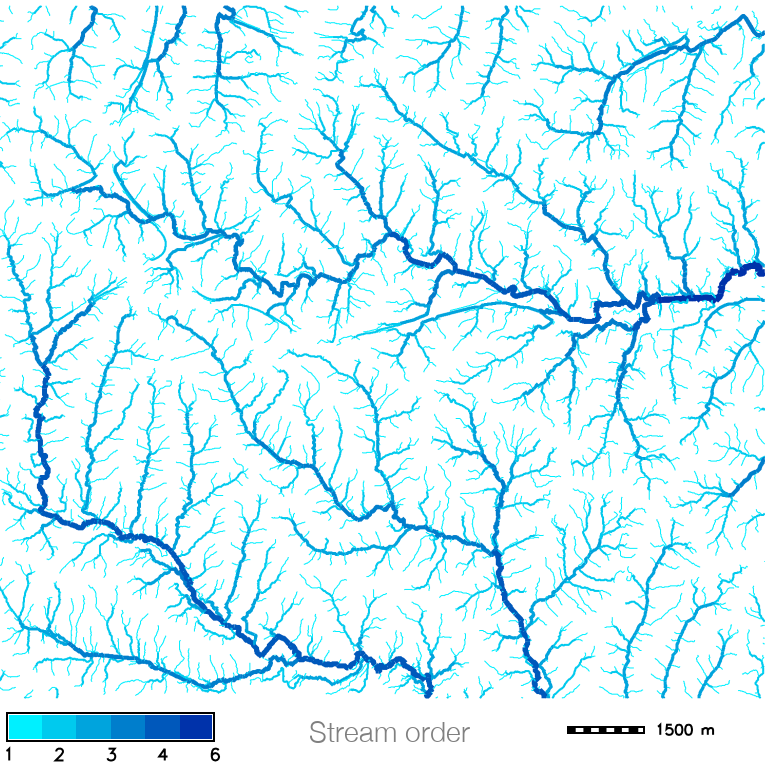
GRASS workflow provided in GRASS for Designers by Brendan Harmon
Color ramps for continuous data: summary
- discrete: based on discrete categories derived from continuous data
- continuous: colors (R,G,B) are interpolated based on raster data values
- histogram equalized: colors are distributed based on the raster map histogram
- logarithmic
- see supplemental material for many others and explanation of the best practices
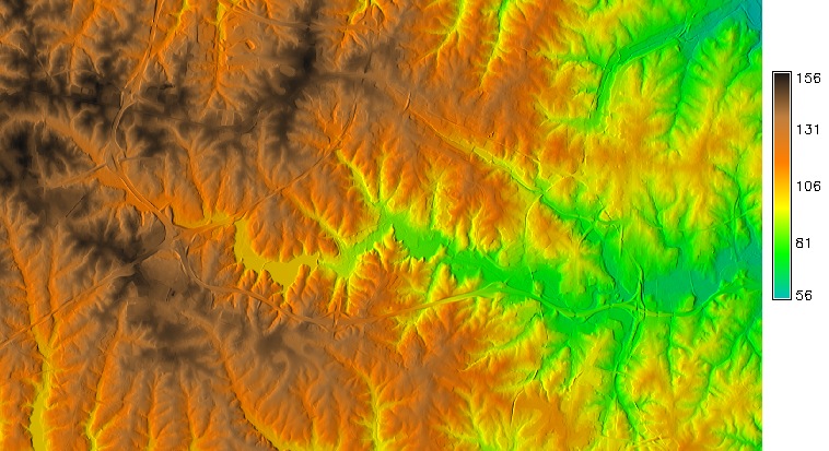
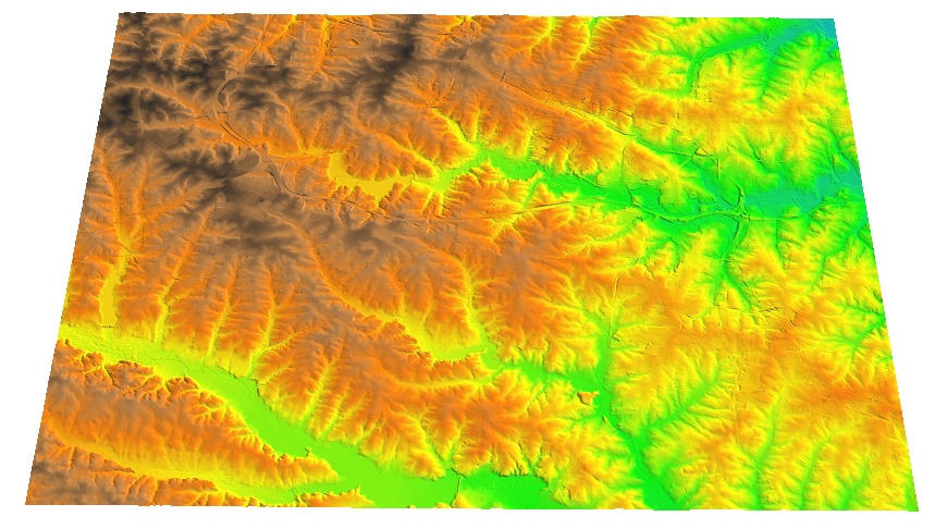
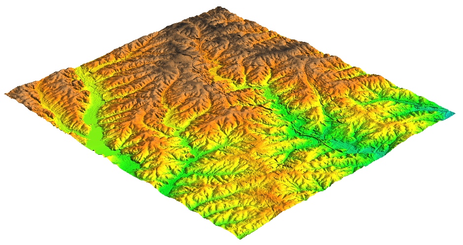
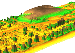
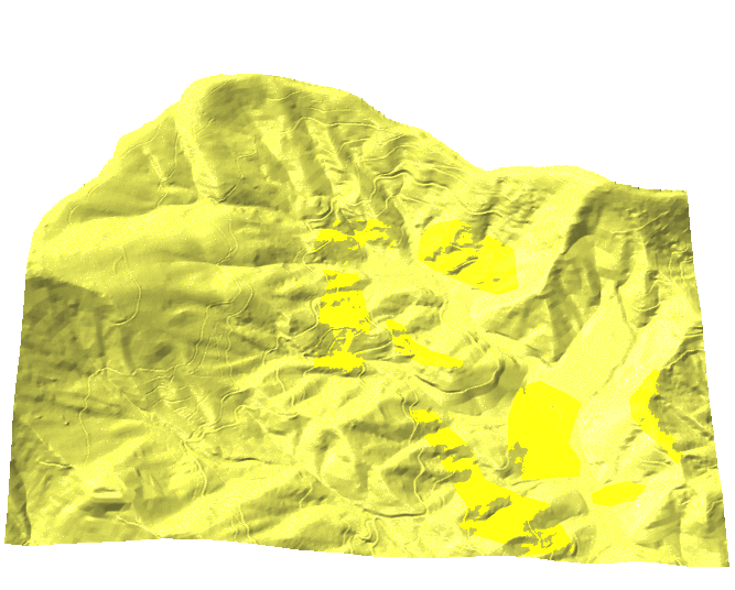
Maps with relief shading
- Color composite highlights relationship between
- the theme values represented by hue
- surface structure represented by brightness derived as shaded relief (illuminated topography)
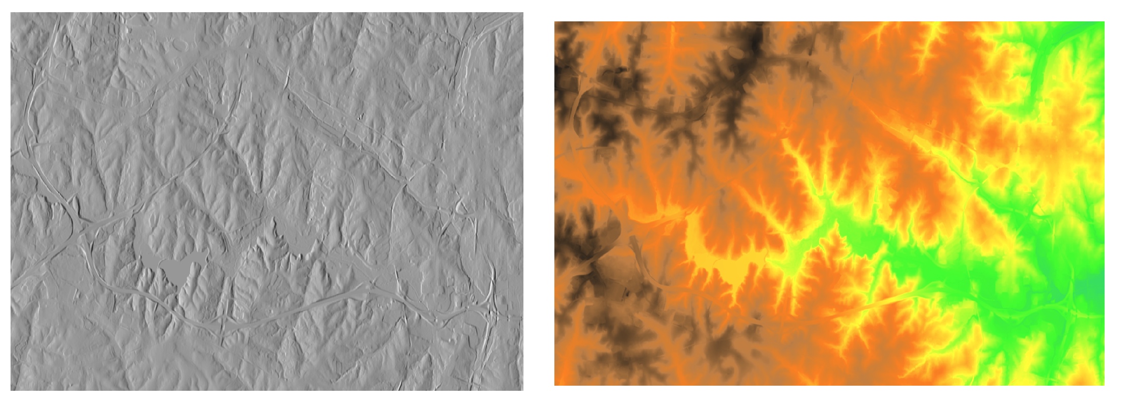
Relief shading
Resulting color composite for elevation theme
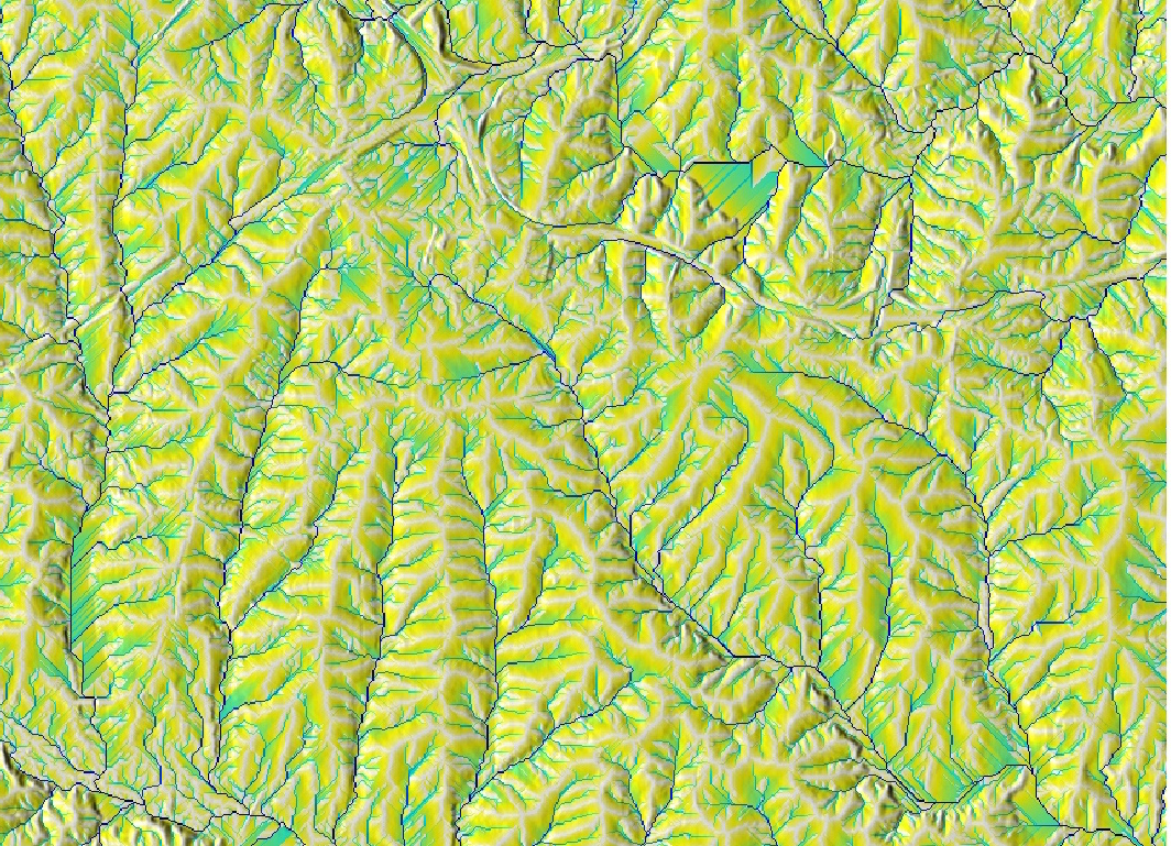
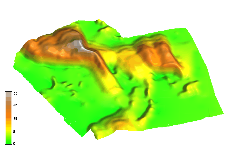
Relief shading
Color composite for flow accumulation with elevation
From image to map
- Display of raster and vector data does not make a map
- Map: cartographic representation of geospatial data
- Map elements position the image on earth and explain the content
Map elements
- data frame - map content image
- elements outside the map image
- legend and title, scale and north arrow
- coordinates, citation, metadata
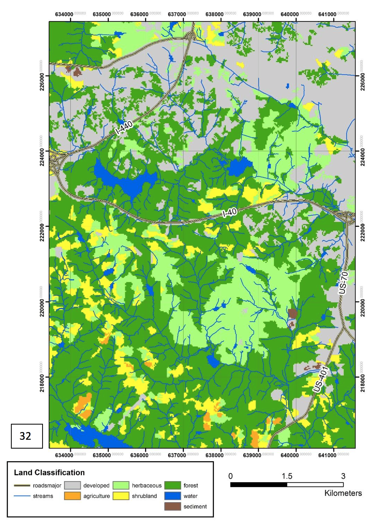
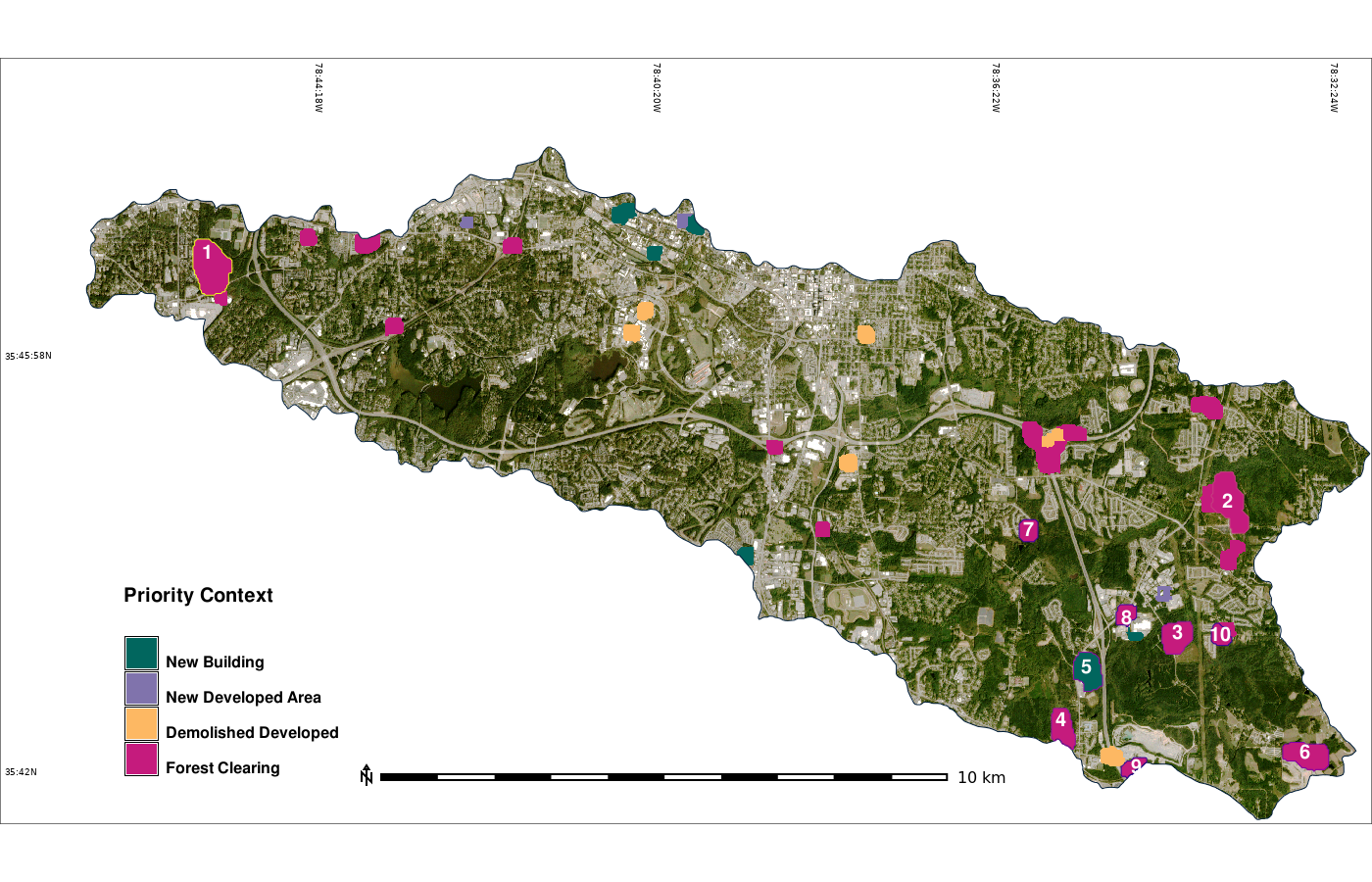
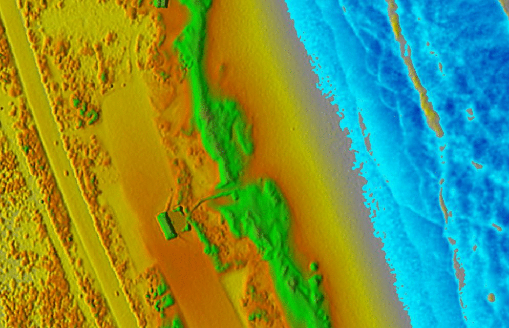
Images from report by Hahn, GIS582 and Corey White et al, 2022, Rapid-DEM: Rapid Topographic Updates through Satellite Change Detection and UAS Data Fusion. Remote Sensing 14(7), 1718.
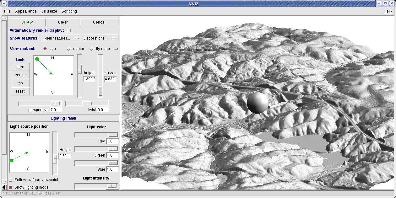
Visualization in 3D perspective
- Projection of 3D object into a 2D space: perspective
- paralel lines intersect in vanishing point(s)
- scale depends on distance from the viewer
- only visible part of surface is rendered: interactive exploration is important for viewing obstructed data
Parameters of 3D perspective
- viewing position (height, distance and angle)
- surface position, z-scale, resolution
- surface color: raster map, vector data
Light and shading
Important for visual representation of surface structure
Useful for identification of subtle features or artifacts
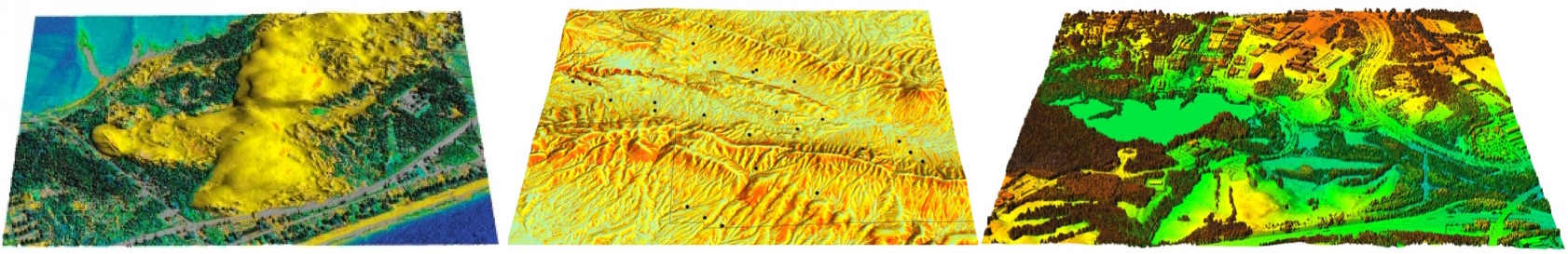
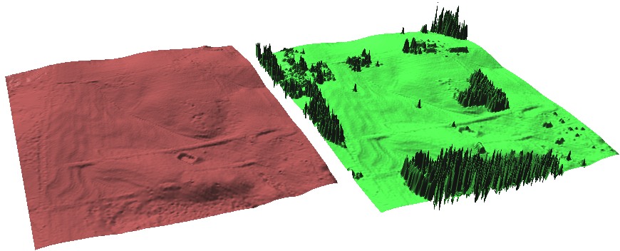
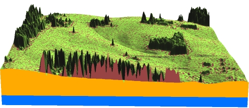
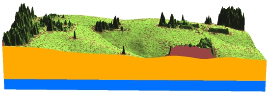
Multiple surface visualization
Applications and properties
- Lidar: bare ground and surface with vegetation
- Change in topography (coast, development)
- Geological or soil layers
- Vertical scaling is important: vertical distances often 1-3 magnitudes smaller than horizontal
- Display: side-by-side or stacked
- Interactive cutting planes for exploration of stacked surfaces
Multiple surface visualization
Side by side: Bare Earth and Vegetated Surfaces derived from lidar data
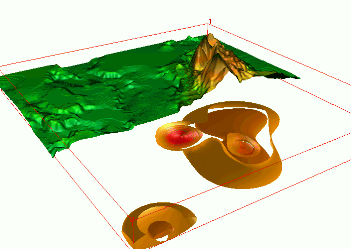
Multiple surface visualization
Stacked surfaces with crossections
Dynamic visualization: animations
- When to use animations:
- dynamic simulations: ocean surge, flooding, wind, pollution, migration, urban growth
- time series of data : migrating landforms, temperature, precipitation, melting of ice cap, urban growth
- method analysis – changing a parameter or crossections
Animations in 3D
- Dynamic process: overland flow simulation using path sampling method, time series of particles and water depth maps draped over static DEM
Animations in 3D: examples
Jockey's ridge:
Dynamic surfaces: series of changing surfaces, static viewing position
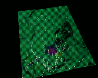
Space-time cube: landforms
Jockey's ridge: evolution of 16m elevation contour, isosurface evolving over time
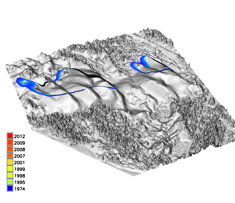
Animation by A. Petrasova, see also Tateosian L., et al. 2014, Visualizations of Coastal Terrain Time-series, Information Visualization, 13 (3) pp. 266 - 282.
Animations for voxel models
3D vegetation structure from multiple return lidar point cloud: moving cross-section
Animations in 3D
Fly-by: static features explored by moving viewing position
Dynamic isourfaces from multi-temporal voxel model
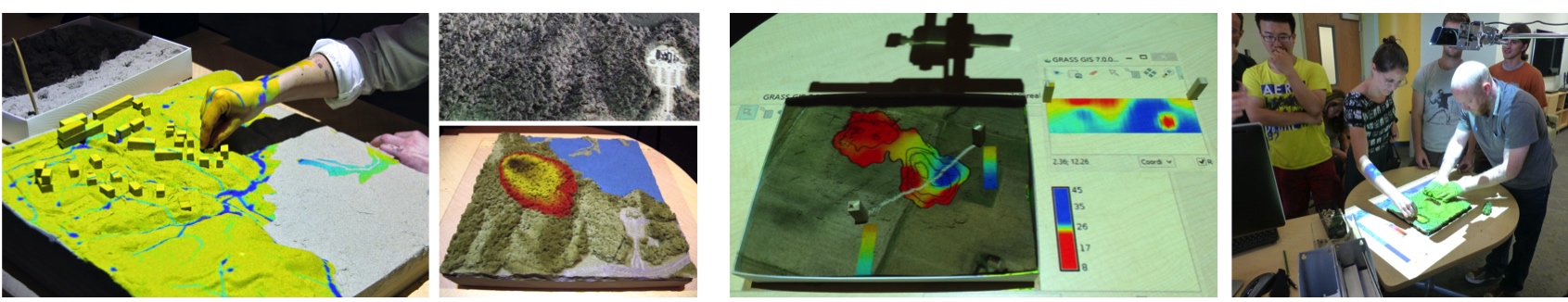
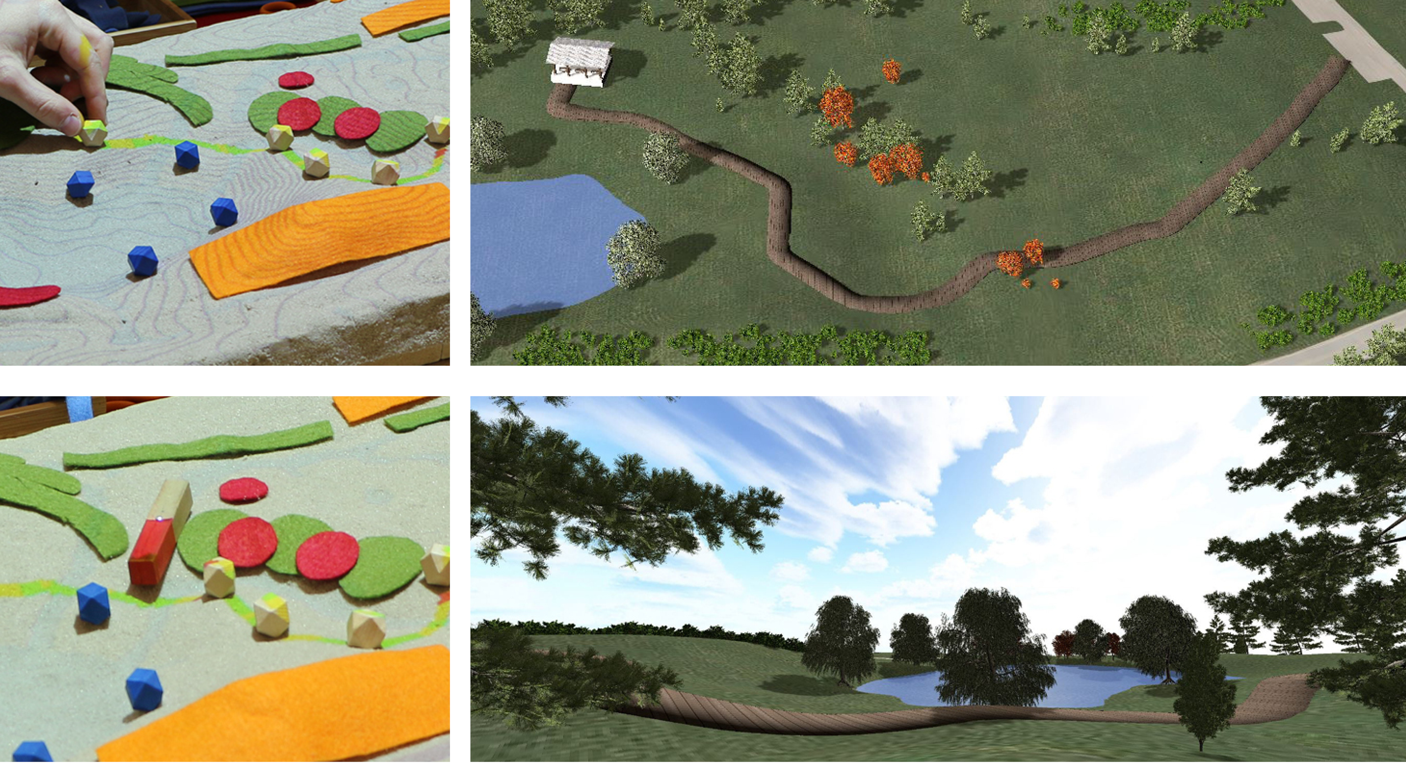
Tangible Landscape
Bringing people together around GIS: Tangible user interface for GRASS
Designed to make working with geospatial data and simulations engaging, and fun
Petrasova, A. et al. (2018). Tangible Modeling with Open Source GIS. Second edition. Springer International Publishing. https://doi.org/10.1007/978-3-319-89303-7
How does it work?
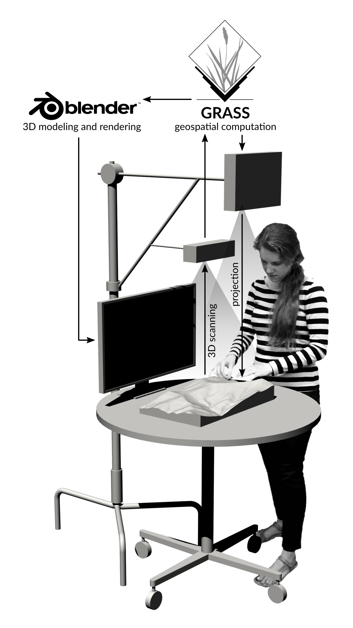
Tangible Landscape couples a digital and a physical model through a continuous cycle of 3D scanning, geospatial modeling, and projection
Interactions
Coupling with 3D rendering
Tangible Landscape for education
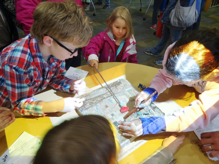
TL as a geosimulation environment in GIS714
Summary
- display of raster and vector data: scaling properties
- color ramps for raster data, relief shading
- map elements
- 3D visualization: single and multiple surfaces
- dynamic visualization with animations
- Tangible Landscape